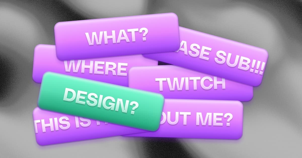
Twitch Stream Panels: Size, Design, and What to Include
Twitch panels are the strip of content below the video player on your channel page. They sit below the fold and are easy to ignore - but they are the section most viewed when your stream is offline. That is when first-time visitors are reading them and deciding whether to come back.
Good panels do three jobs at once: they tell a first-time visitor who you are, they give returning viewers the information they came for (schedule, socials, how to support you), and they carry your visual brand so the channel feels like one coherent thing instead of a default Twitch layout.
Twitch panel size and dimensions
Twitch renders panels at exactly 320 pixels wide. That is fixed regardless of screen size. Height is up to you: Twitch accepts panels up to 600px tall, and the upload limit per panel image is just under 3MB - keep files compressed or you will hit an upload error with no helpful error message.
Width is non-negotiable at 320px. Height varies by what the panel needs to show:
- 80-120px: Icon-only or icon-plus-label panels. Clean and fast to scan. Good for a social icons strip or a single-line 'Donate' button.
- 140-200px: The most versatile range. Fits an icon, a one-line heading, and 1-2 lines of body text - enough for a compact schedule, a short About blurb, or a setup list.
- 220-320px: Text-heavy panels like chat rules, detailed About sections, or annotated setup lists. At this height you have room for content, but keep font sizes up - panels at this range invite too much text.
- 320-480px: Occasional use for rich panels like a schedule calendar, sponsor section, or illustrated setup graphic. Use deliberately.
File format: Use PNG for panels with text, icons, or transparent edges. Use JPG for panels that are mostly photographic backgrounds - the file size savings are worth it. For animated panels, Twitch accepts GIF files.
Mobile: Twitch stacks panels vertically on mobile at slightly smaller than their desktop size. Text that is borderline readable on desktop is often unreadable on mobile. After you upload any new panel, open your channel on your phone before moving on.
The 6 panels every channel should have
Panel order matters. On mobile, panels stack vertically and many viewers never scroll past the first four. On desktop, Twitch displays two panels side by side. Either way, prioritize ruthlessly.
1. About Me
First panel, almost always expected. Two to three sentences: your name or alias, what you stream, and one thing that makes the channel distinct. Keep it brief enough to fit at 140-180px tall.
Example: 'Hey, I'm Alex. I stream Tarkov and IRL travel vlogs - mostly competitive Tarkov runs with chat, and the occasional 'I got lost in a new city' series. Based in Berlin but online whenever there's wifi.'
2. Schedule
A static panel image of your weekly hours. Even if you also use the Twitch native schedule tab (which you should), the panel is what most returning viewers see first. Use day-of-week labels with times in your home time zone, and add a small 'all times CET' footnote so international viewers know what they are looking at.
If your schedule changes often, link the panel to a dedicated schedule page that stays current - this is one of the things a Pulz page handles automatically, since it pulls directly from your Twitch schedule.
3. Socials / Link In Bio
One 'Find me elsewhere' panel that links to your bio link page beats six separate platform-icon panels. Simpler for the viewer, easier for you to maintain - you only update one destination, not six panel images whenever a social changes.
Make the link clickable. This sounds obvious, but a common panel mistake is uploading a social icon panel with no link behind it. Viewers will not copy-paste your Twitter handle from a panel image. If a viewer has to copy and paste to reach your socials, most of them will not bother.
4. Donate / Support
Whether you use Streamlabs, StreamElements, Ko-fi, or Throne matters less than being specific about what support enables. 'Tips help cover game keys and the next mic upgrade' converts better than 'Support the channel'. A specific, honest ask performs better than a vague one.
5. Setup / PC Specs
This panel gets more genuine engagement than most streamers expect. Viewers in FPS, sim, and tech categories are genuinely curious what you use. List your main gear - mouse, keyboard, mic, headset, monitors - with affiliate links if you have them. Keep the labels honest and only include gear you actually use.
6. Chat Rules
Three to five rules, short and direct. 'No spoilers, no spam, no hate speech' covers more than a paragraph of legalese. The purpose is to give moderators something to point at during incidents - not to be read by every viewer. Design for scannability, not comprehensiveness.
Panels that are usually a waste
- Separate icon panels for every social platform. Six platforms mean six panel images to maintain. One 'Socials' panel pointing to your bio link page handles all of them.
- Sponsor logo dumps. Unless the deal explicitly includes panel placement, a wall of brand logos makes the channel look like a racing car sponsorship. One 'Partners' panel is the max.
- Outdated event or tournament panels. An old charity stream or tournament announcement that ended months ago is just clutter. Remove it.
- Sub-goal panels. Twitch has native sub goals that surface during streams. A standalone sub-goal panel between your About and your Schedule is dead real estate.
- Three-paragraph personal story panels. A wall of text below the fold rarely gets read. If the story matters, it belongs in the About tab. Panels are for short, scannable information.
Design rules that actually matter
Panel design fails the same way every time: fonts too small to read on mobile, five accent colors that feel like a mood board, or panels that each look like they came from a different channel. Three rules prevent all three problems:
- One typeface, two weights. Mixing fonts across panels makes the channel feel assembled from spare parts. One sans-serif (Inter, Manrope, Outfit, Space Grotesk) at regular and bold covers every panel type. Pick one and use it everywhere.
- Text readable at half size. Mobile viewers see panels at roughly half their desktop dimensions. If you cannot read the text when you zoom the preview to 50%, it is too small. Minimum practical font size is around 16-18px at 320px design width.
- Two main colors, one accent. Two colors is a system. Five is a mood board. Pick two colors that work on Twitch's dark background and one accent for highlights and icons.
- Design on a dark background. The vast majority of Twitch users run dark mode. The page background behind your panels is approximately #18181B. Preview your panels on that background before uploading - a panel that looks sharp on white can look washed-out or disappear on dark.
Tools for designing Twitch panels
The tool matters less than the consistency, but the right tool removes the two most common failure points: wrong dimensions and a panel set where every panel looks different. Roughly in order of how little design skill they require:
- Pulz Panel Creator (free, browser-based). A panel maker built specifically for this job: you edit your whole panel set side by side in a realistic 320px-wide Twitch About column, apply one template across every panel so the set stays coherent, and export transparent PNGs - one at a time or the full set as a ZIP. No canvas setup, no dimension guessing. It lives in the free Pulz dashboard; the Twitch panel maker walkthrough covers it step by step.
- Canva (free + pro). The general-purpose default: massive template library, drag-and-drop, exports as PNG or JPG. Good enough for most streamers. Two caveats: you have to set the 320px canvas yourself, and thousands of other streamers use the same templates unchanged - customize colors and type so yours doesn't read as generic.
- Figma (free tier). More setup than either of the above, significantly more control once you know it. Worth learning if you have design background or plan to build a full brand system with overlays and social assets in one file.
- Photopea (free, browser-based). Reads PSD files. Useful if you have existing Photoshop-format panel templates you want to edit without buying Photoshop.
- Premium template bundles (Visuals by Impulse, Nerd or Die, OWN3D). Cohesive sets of panels, overlays, and alerts for $15-50. A strong option for streamers who do not want to design but want every stream graphic to match.
- Fiverr / commissioned art. $30-150 for a custom set. The right move when brand-aware sponsorships are part of your plan or when the DIY result is consistently holding you back.
What to link your panels to
The image is half the panel. The link behind it does the actual work - and links rot. Old social icons pointing to dead accounts, donation links to a deleted Streamlabs page, or schedule panels with no link at all are more common than they should be.
For socials and schedule panels especially, linking to a single maintained page beats managing six separate destinations. A Pulz page handles this cleanly: it auto-syncs your Twitch live status, schedule, and top clips alongside your socials and custom links. One link destination, always current, no panel updates needed when your schedule changes.
How often to refresh panels
Treat panels like a small website: review every quarter, update content when things change, redesign when your visual identity changes. Most stale panels are not ugly - they are just outdated: wrong schedule, old social links, discontinued hardware in the setup panel, an expired donation platform.
A quick quarterly check: open your own Twitch channel on your phone. Click every panel link. Replace anything that is stale or broken. This takes 15 minutes and removes the most common reasons a new visitor gets a bad first impression.
FAQ
What size are Twitch panels?
Twitch panels are 320 pixels wide. Width is fixed. Height is flexible: Twitch allows up to 600px tall, but most panels work best at 100-200px for header-style panels and up to 320px for text-heavy panels like rules or detailed schedules. Design at 2x (640px wide) for sharpness on retina screens, then export at 320px.
What is the best panel height?
There is no single answer, but 140-180px covers most panel types well: an icon plus a heading plus one or two lines of supporting text. For panels that are mostly imagery or a single label, 80-120px is cleaner. For text-heavy panels like rules or a detailed About, 220-300px gives you enough room without the panel looking cramped.
What is the best free Twitch panel maker?
The Pulz Panel Creator is built specifically for Twitch panels: it previews your whole set in a real 320px About column, applies one template across every panel, and exports transparent PNGs or a full ZIP for free. Canva is the strongest general-purpose alternative if you want full freeform control. The panel maker walkthrough compares both.
Can panels have animations or GIFs?
Yes, Twitch accepts GIF files for animated panels. Animated panels look novel for about a week and become distracting afterward. If you use one, animate a single panel - not the whole strip. A subtle loop on a 'Now live' or 'Support' panel is the common use case.
Do panels affect Twitch discoverability?
Panels are not a Twitch search or recommendation signal. Their value is conversion: turning a profile visit into a follow, a panel click, a Discord join, or a return visit. Focus on making them clear and clickable rather than optimizing for any algorithmic effect.